Saturday, March 22, 2014

Tumbling into the rear

Well at long last I have managed to finish my piece.  A family event had kept me from my sewing machine and the muse was having no artistic licence at all.  Nevertheless, I spent time trying to coming up with something.  I had recently attended a workshop by Sue Benner, where we studied various design concepts. One in particular, rectilinear design, nudged my creative juices.  I started looking at square, rectangular, and oblong design settings.  One in particular kept coming up.  Here is a picture of what I kept seeing.
 and another one

Numerous pictures of "Tumbling Blocks" quilts.

I had created some "odd" blocks in Sue's class that gave the impression of being tumbled.  They looked like this.

I had already given an idea to Lisa for this challenge so I couldn't use that one.  She blogged about it here. Yup! That's when the epiphany hit.   If artistic licence gives me the freedom to take something, change it, and still have it be recognizable, then here is my rendition.
But to get the entire effect of how I used artistic license here is the full picture.  You can read about it's construction here.
Go figure...I've called it Blocks Tumbling. Ta da, more artistic license!  LOL!  Thanks Judy for the theme.  It was a challenger.


Tuesday, March 18, 2014

YIKES!!!!! I'm late!!!!


I'm Late
From "Alice in Wonderland"
Music and Lyrics by Sammy Fain and Bob Hilliard

I'm late!
I'm late!
For a very important date!
No time to say "hello", goodbye!
I'm late!
I'm late!!
I'm late!!!


No, no, no, no 
I'm overdue!
I'm really in a stew!
No time to say "goodbye", hello!
I'm late!
I'm late!!
I'm late!!! 


I probably shouldn't be smiling! 
My apologies for my extreme tardiness
but it seems that I have been bogged down by a variety of obligations
 and unexpected circumstances... 
and I'm almost out of gas!!!

I have to admit that I did get a (very) late start 
(my days of punctuality seem to be a thing of the past!)
and after pondering...
 and hemming and hawing a lot, 
I went with an idea that Brigitte had suggested (in jest?!) in an email exchange we had
 after this challenge was announced!

It was really a literal translation of "artistic license".... 
as in that which you might have on the license plate of your automobile!

(I still have to add some brads and perhaps "New York" to the license)


And...
while my piece is late,  
not done,
 and seems to be never-ending,
it was time to reveal what I have to the group.

"I'm Late!" is a  true mixed media work..


watercolor crayon/pencil on canvas
with free-motion stitching
collage,
Transfer Artist Paper (TAP),
hand embroidery,
rubber stamping on painted Lutradur
 and more!

And thanks again to Brigitte for the idea!!!

Sunday, March 16, 2014

Colourblock

I had a bit of a time deciding on how to approach this challenge.  In the end, I went the way I was most comfortable with - partly due to wanting to actually have something to show today, and partly because, well, it was comfortable!  I guess I haven't quite broken loose of my comfort zone, and kicked that box aside!

I'm not one for fussy - I prefer clean and simple.  I like graphic.  I like lines.  I like colour.  I like balance, although I don't always achieve it myself.  Piet Mondrian's style suits me.   (to see an interesting presentation of his work, and how it changed over his life as an artist, check this video).

gridwork

I took the idea of a limited colour palette, and played with lines and gridwork.  I introduced some neutrals, in the shape of white, grey and black.
I added additional lines through the use of stitch.
stitch

I like what I ended up with.
Colourblock

finished size 16 x 16


Artistic License- Beverly

Artistic License, 16" X 20" (approx.)
Hand dyed cottons, machine pieced, machine quilted

I knew going in to this challenge that I wanted to learn more about the minimalist artists.  Piet Modrian was the first I thought of, but a little googling and I came up with several others I liked.  Not only does the 'less is more' esthetic appeal to me, I also learned where a lot of modern quilts draw their inspiration from.

So what is my 'license'?  Modrian used primary colors, I used secondary.  He framed his colors with black, I used white.  This piece was also used to answer some "what if" questions I posed.  What if I used more than one color thread for quilting?  What if I used squares and rectangles for my quilting designs, but did not echo the squares and rectangles on the quilt, but created another layer of design?
It's also another piece to see how I can showcase hand dyed fabric (in this case, snow dyed) in a design surrounded by solids.

It was interesting to see how the effect of the color changes with the threads influenced the look of the fabric.  It was most obvious on the snow dyed fabric.


I was also interested to see how the thread color influenced the negative white space.  I'm not sure how I feel about that yet!

It has been a long year with the muse largely absent for me.  I'm beginning to wonder what it will take to get her back!

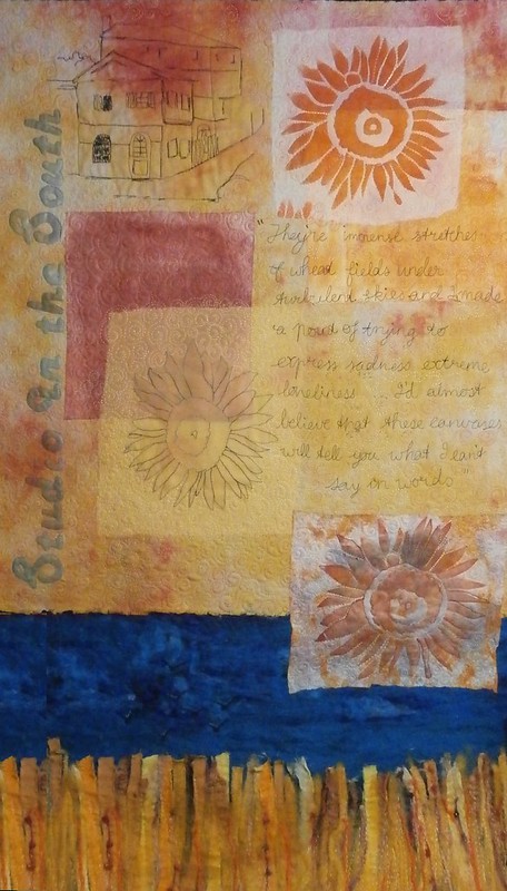
I could have told you vincent

As you all know, my piece for this is about Vincent van Gogh.
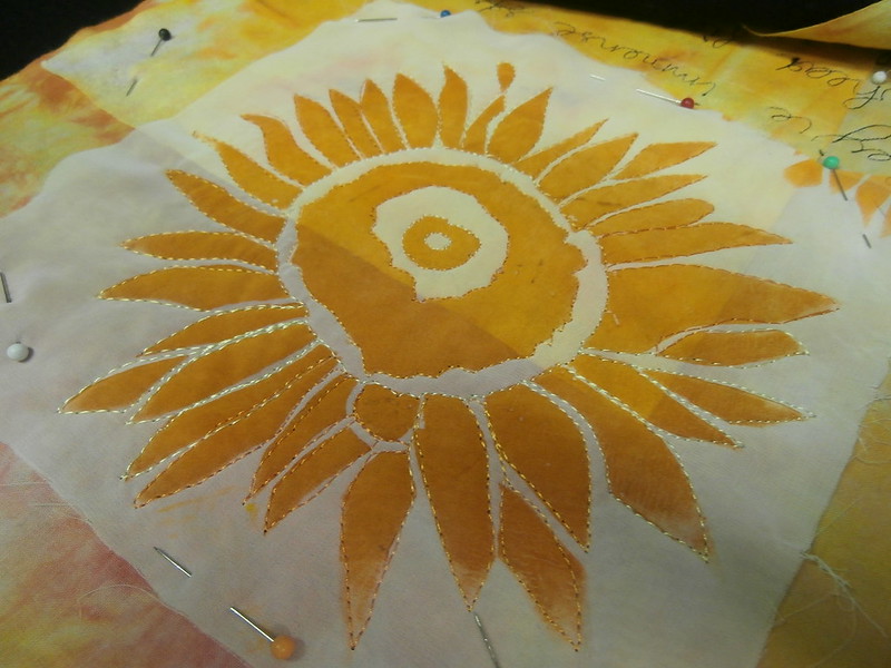
It all started with some sunflower prints...
What else comes to mind when you think of sunflowers and art.
A little bit of needlefelting
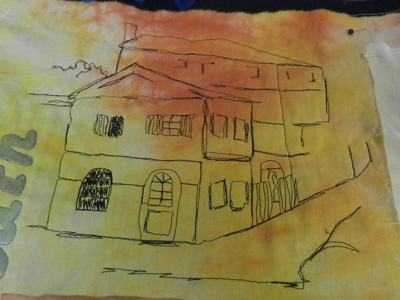
Some thread sketching
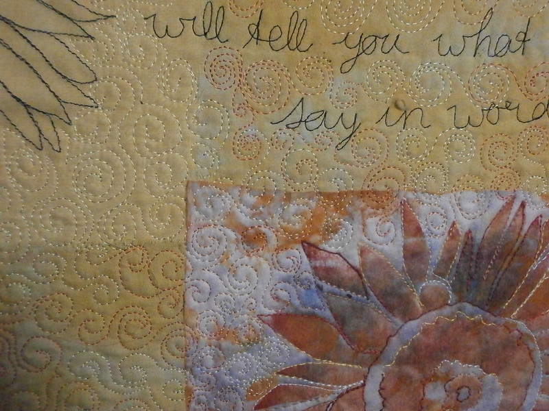
Some quilting
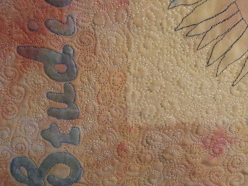
I thought the spiral went well with Vincent.  More quilting
And a whole lot more quilting
And I finally had something I liked.  No-one said anything about size, so I went a bit overboard (sorry)

You can see the step by steps-
here 
here
here 
here
and here
Hope you like it!

The Monarch

Inspiration:


Concept: A single egg laid on a pesticide-free milkweed leaf can help save the Monarchs.

The Plan: Depict a milkweed leaf with a single Monarch egg. Use the colors of the caterpillar to represent the Monarch. I started looking closely at the plants in our yard, then searched the internet for close-up photos of the milkweed leaf. Then I did a rustic sketch of my idea and did a color version on my Asus tablet. 
The Making: I wanted to use hand dyed fabric for the main body of the leaf as I didn't want a totally solid piece of green. I was glad that I had kept some samples and actually labeled them from the last time I did some dyeing. 
 Luckily I found a piece large enough and with enough variegation that I was totally happy to use it rather than dye a new piece.
 I laid out the basic leaf adding some darker green for shadow effect and possibly a red piece down the center vein. (later I chose to use thread instead of the red fabric)
I did a few sample pieces of painting in yellow veins but opted to keep it simple and clean, choosing the 'less is more' idea. 

The Monarch: created with Artistic License.....

I used gold metallic thread to stitch around the white egg to represent the importance of these tiny little pieces of nature. They are fragile and need our help.

Thank you Judy for "Artistic License". I was very inspired!


Homage to Braque


For years I have been a fan of the works of Georges Braque, particularly his works which were created during his Synthetic Cubist period, 1912-1914. What I admire are the interplay of shapes, the depth and playful way he breaks up recognizable shapes and his addition of bits of life's ephemera, like a piece of a concert ticket or a leftover scrap of a note. Below are some of my favorites.

Left to right- Gueridon 1913, Still Life with Violin 1913
Violin Melodie 1914, Violin and Glass 1913
I didn't want to just reproduce something Braque had created, however had I done so, I might be more satisfied with my end product. 

Because I do not draw or sketch, I started by making paper collages with various shapes, colors and textures. More images can be found on my blog

Final design 
After deciding on a design, I selected fabrics from my stash. I also wanted to use some paper cloth for some of the shapes. Paper cloth is basically paper adhered to muslin with diluted glue. In the paper cloth I created, I used dress patterns, tea bags, newspaper, and computer images I had printed. In addition to the fabric and paper cloth I also included words printed on silk photo fabric.

The next major step was cutting out the shapes and adding fusible web to the backs so they could be adhered to the base fabric. I wanted a neutral background and chose a funky gray fabric.


However, after living with this decision for several days, I decided it was a depressing color and changed the background to a lighter fabric.

Homage to Braque
16"x 20"


Friday, March 7, 2014

A Beginning

It is awfully quiet, here at the TT blog. I hope you are just bursting with excitement and are progressing on our challenge due March 16. Here is something to keep you guessing.